OkCupid is a US-based online dating app and website that allows users to find romantic partners, friendships, and networking opportunities based on shared interests and values. Users answer thousands of questions about lifestyle, beliefs, and preferences. Its algorithm calculates a Match % to indicate compatibility with other users
user research
ux design
Concept Design
Journey Mapping
mobile app
Role
Product Designer (Team Lead)
Type
Project
Timeline
12 days
Year
2025
industry
Partner Matchmaking
We went in to explore what a first-time signup actually feels like, with no fixed hypothesis and no read-up beforehand; the only thing we knew going in was that this "trust score" existed somewhere in the app.


Completing your profile triggers 14+ questions with no skip and no save-and-exit — set "hookup," and you're still asked about settling down.

A small scroll on Likes triggers a full-screen buy prompt; a "dealbreaker" toggle that looks like a normal switch opens a paywall instead; Messages alone stacks three separate price points (premium, boost, superboost).
Your profile with no picture gets shadow-banned from discovery with zero warning.
(hidden the face on purpose to maintain privacy ))

We got to know about this by casually uploading a photo of a UNO cards as a profile picture. It was accepted. This was another cue why even we won't trust what's coming in our discovery.


That depth was genuinely double-edged. More questions should mean sharper matching, but our intent was set to "short-term," and we were still being asked about wanting kids and political views.
The same thoroughness that could make this app's matching stronger is exactly what made it feel invasive and mistimed here.


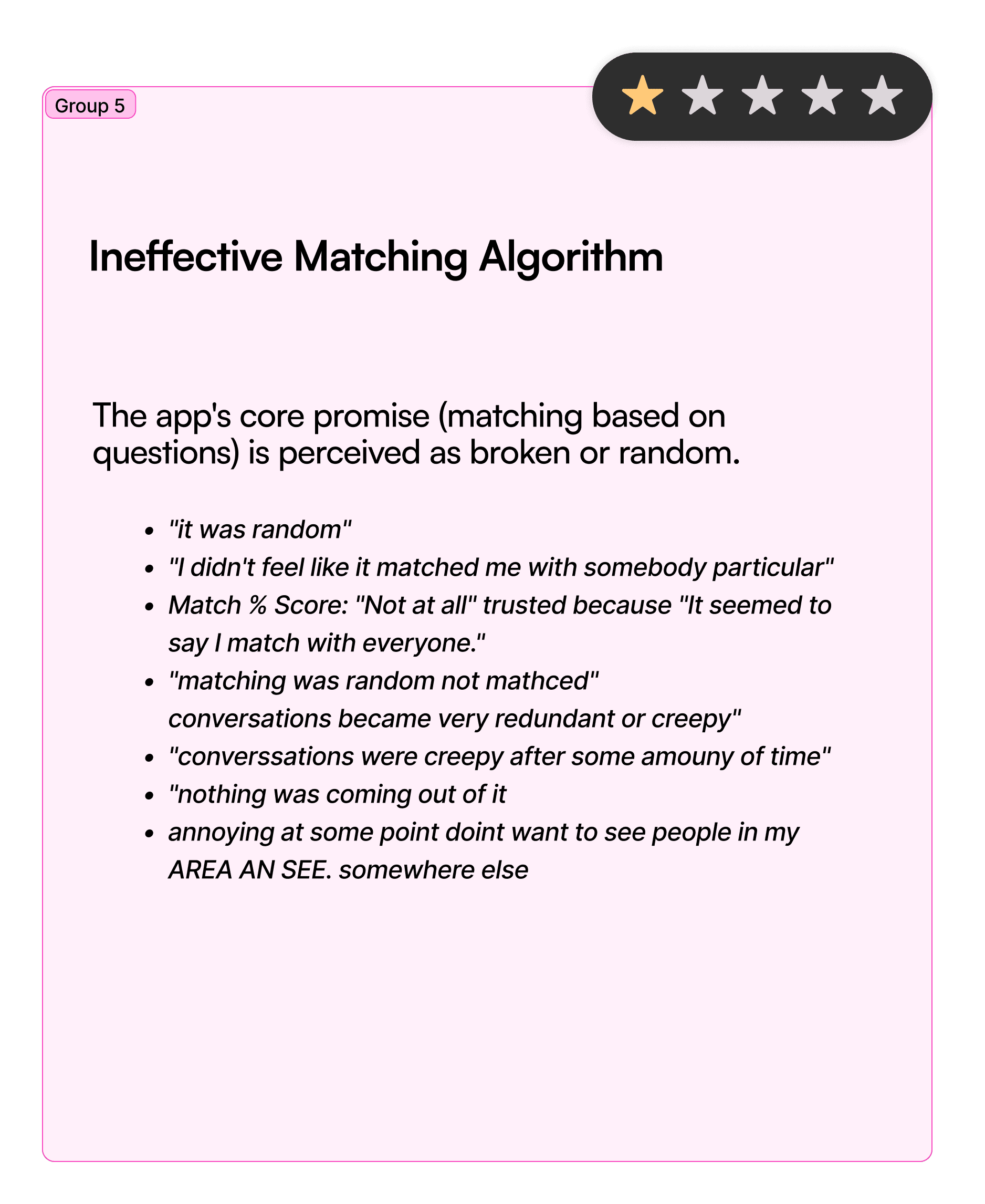
The clearest pattern was the match score.
Participants converged on nearly identical language - "0%" trust, "not at all," "it seemed to say I match with everyone."
Mismatch in preferences
One participant who deleted the app within two hours said her preferences didn't hold and profiles kept showing up outside her age range, which she called "a bit creepy."
Skewed gender ratio
A small business owner in Jodhpur added: in a smaller city, an already skewed gender ratio made the app feel more unusable, and matched with scam profiles more than once.


How might we?
Users do not trust the app's profile Match Score. This creates a fundamental trust gap, as they do not believe the score is a genuine or accurate reflection of compatibility. How might we help users trust that who they see — and how they're matched; is real?




→
→
→
→
→
→


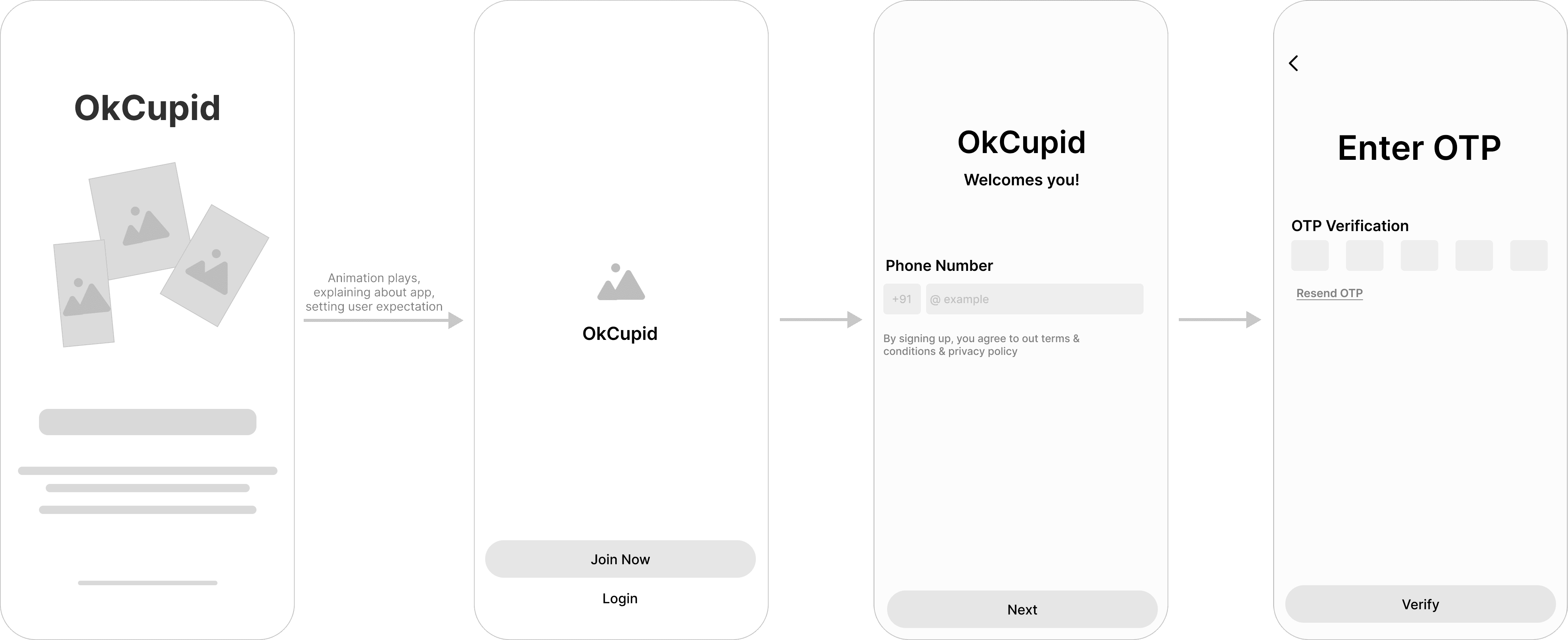


A profile-building app asking for real information upfront isn't the problem; the original flow's failure wasn't its length, it was that all that invested effort led nowhere trustworthy. So instead of racing to shorten it, we staged it:
with a visible progress bar and skippable questions throughout, so time spent is at least spent knowingly. Mobile-number authentication replaces email as the primary path, cutting down fake accounts at the source.

Long-term, short-term, casual, and hookup each run a distinct set of questions instead of sharing one generic list — so a short-term user is never mid-flow answering about wanting kids )

Added a nudge "x people around your preferred location have same goal" on the intent screen. It gives users a concrete reason to believe a match is possible before they've invested any time.
Banners, and small cues are placed all over the flow, so the user feels confident and assured moving ahead

AI-generated bio prompts pull from the intent and personality answers already collected, so writing a bio isn't a blank-page problem.
We considered the reverse order too — asking for the bio first, then using it to shape suggestions, but sequencing it after the rest of the flow gives the system more signal to work with.

Users see exactly how their profile will look to others before it goes live, with the option to edit directly from that preview instead of backtracking through settings.

Users define their non-negotiables right after their intent questions, and those appear as scannable tags on every profile card.
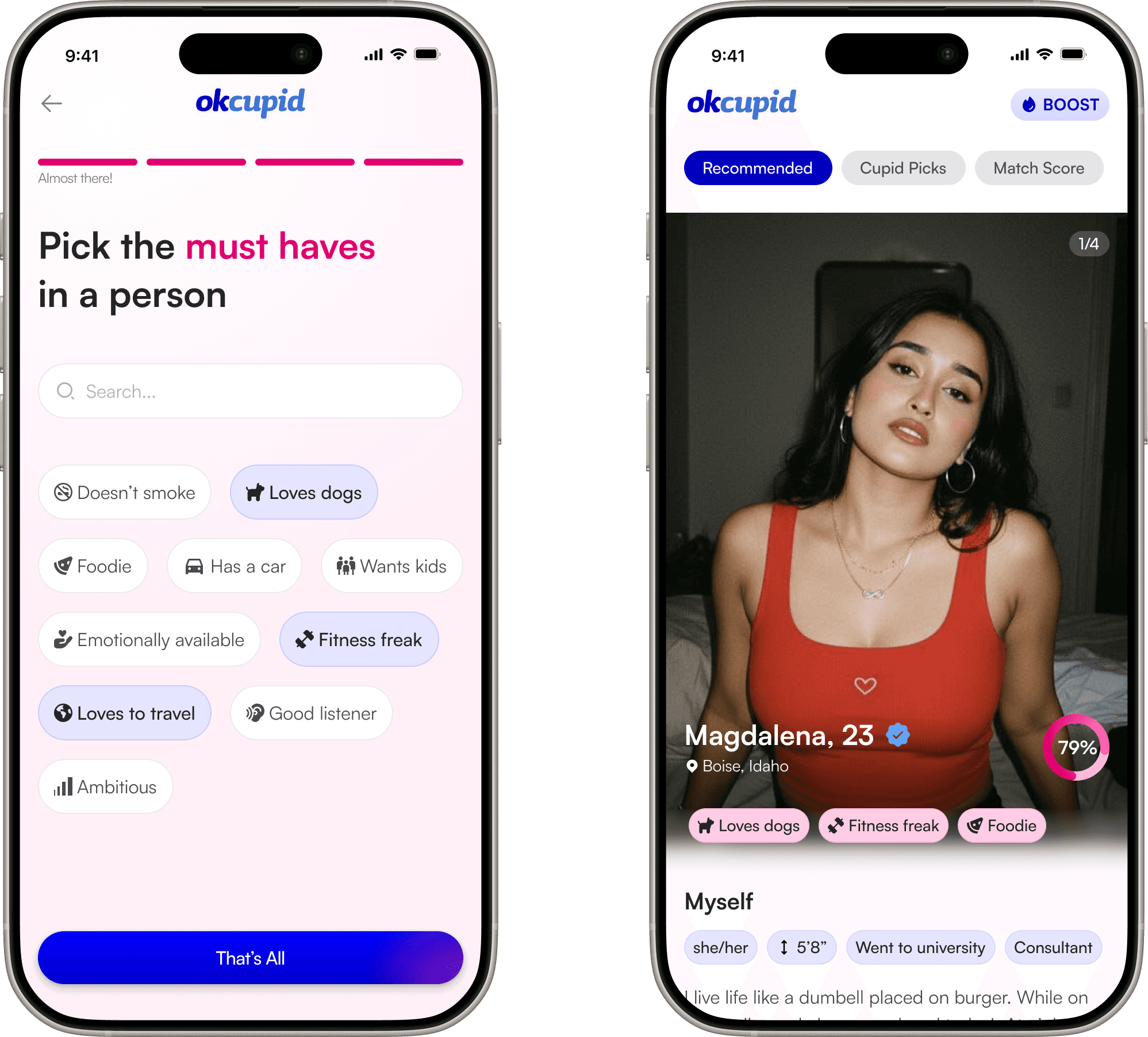
The score is no longer a number taken on faith. Every match shows the shared must-haves, hobbies, and question answers that produced the score — the trust score finally shows its work.

rated from 10 participants out of 12
The dominant reaction when testing the redesigned flow
1.
The strongest finding wasn't planned — it emerged from paying attention.
We didn't set out to test the trust score specifically. It became the story because it kept showing up, unprompted, the longer we used the app honestly.
2.
Trust is an architecture decision, not a feature.
A badge or a number doesn't fix it. Every score needs a "why" a user can actually open and check — that's what the redesign is really built around.
3.
The best spec wasn't a competitor app — it was real behavior.
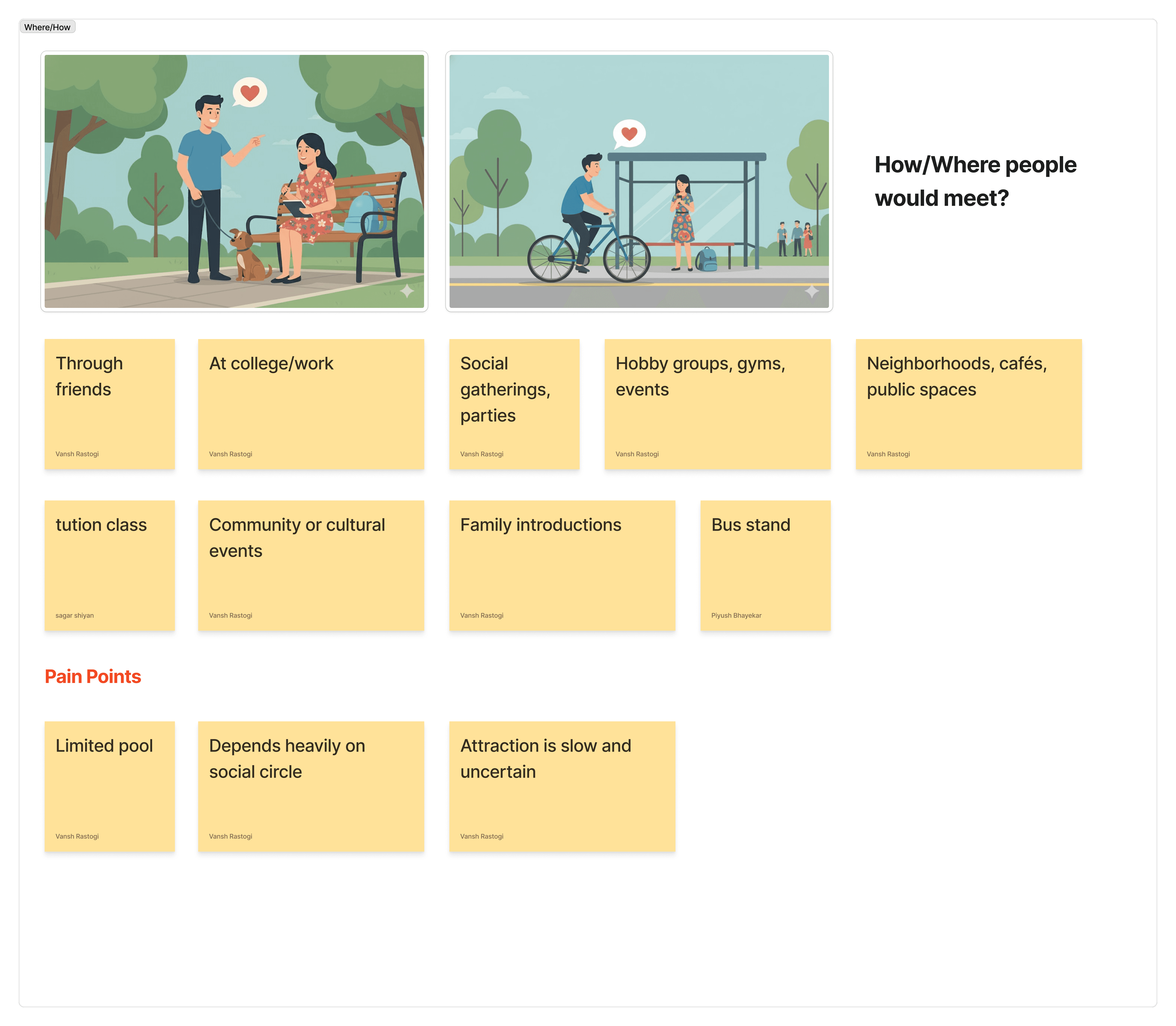
Comparing OkCupid to Hinge or Bumble told us what features existed elsewhere. Mapping how people actually build relationships offline told us what was missing here — and that's what drove the biggest structural change.
fin

Supercharge your team’s productivity with NuSync™